How to add movement to a website
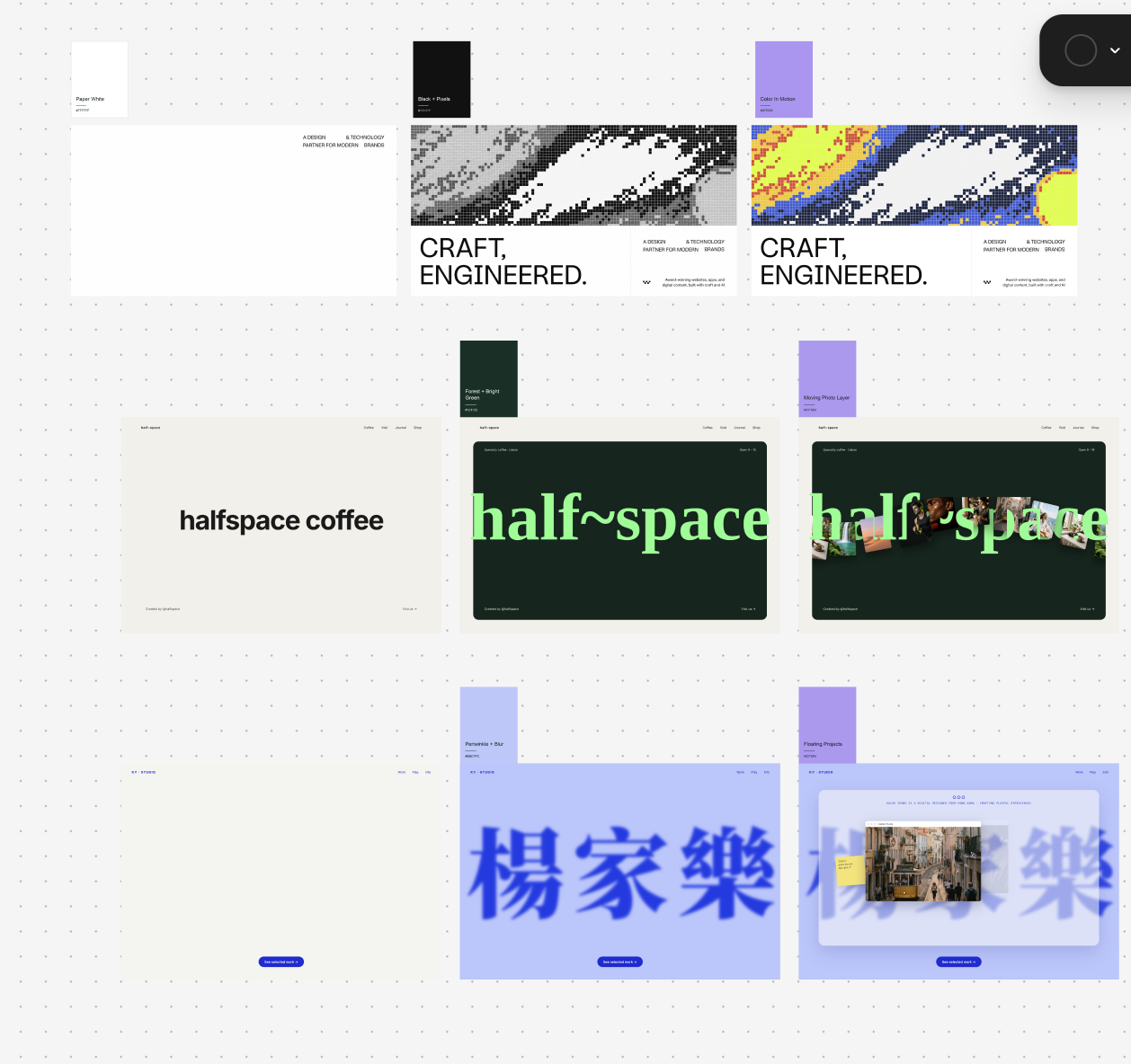
Paper white. Pixel field. Precise. A wave of color rolls through the grid, and suddenly your eye follows it. You can get a different kind of movement by letting a photo slip behind one letter and cross in front of the next.
Start with a screenshot of your own homepage. Circle the thing you want someone to notice first. Keep the rest of the layout still while you try one of the treatments below.
Send a wave through a pixel field

The grid ends at a hard edge above “CRAFT, ENGINEERED.” Your eye can follow the color across the banner and still find the headline in exactly the same place.
- Put a white headline block under a shallow, full-width banner. Keep the headline, navigation, and link outside the banner.
- Draw a low-resolution grid in the banner. Start with square cells about 5–7 pixels wide. Arrange black, gray, and white cells in a broad diagonal wave. Check that you like this frame before adding color.
- Sweep a band of cobalt, yellow, and coral across the grid. Change the color inside each cell and keep its position fixed. Try sin(column × 0.08 + row × 0.12 − time) as the starting value for choosing each cell’s color.
- Let one wave cross the banner in about six seconds. Pause on any frame and read the headline. If the banner grabs your eye a second time before you finish the words, slow it down.
Build a white portfolio hero for [studio name]. Above my headline, draw a crisp square-pixel banner with a grayscale diagonal wave. Send a narrow band of blue, yellow, and coral through the existing cells on a six-second loop. Keep the type and button stationary. Add a pause control and show a composed still frame for reduced motion.
Weave photos around a wordmark
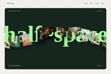
The cream frame and green wordmark already identify the coffee shop. The dimensional cue is the overlap. At one letter, a photo disappears behind the thick stroke. A little farther along, another photo covers the edge of a letter.
- Set a forest-green panel inside a soft-cream page. Fill most of the panel width with your name in bright green. Use live text so it stays sharp at every size.
- Pick five small photos with different silhouettes. For a coffee shop, try a cup, a doorway, a barista, a table, and a detail of the space. Crop them tightly enough to read at thumbnail size.
- Stack three layers in the hero. Put two photos behind the wordmark, the wordmark in the middle, and the remaining photos in front. Offset their starting positions so one edge visibly tucks behind a wide letter as another crosses in front.
- Send the photos along one shallow arc. Start with a 12-second pass and only a few degrees of rotation. On a phone, try three photos. Keep the name readable and the order button clear throughout the loop.
Use my wordmark [name] and these five photos to build a coffee-shop hero. Set bright-green lettering on a forest panel inside a cream page. Move the photos slowly along one shallow arc. Place two photos behind the live text and three in front so individual strokes visibly hide and reveal the images. Keep the CTA outside the moving layers. On mobile, use three photos. Include a pause control and a still composition for reduced motion.
Float a project into focus
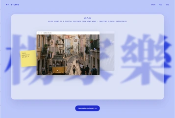
The periwinkle field and blurred blue lettering set the mood. The sharp project thumbnail tells you which work to open.
- Put the large decorative lettering on the back layer. Apply blur to that layer alone so the project title and link stay sharp.
- Place one project card over the lettering with a thumbnail, title, and link. Give it a resting position that already works as a static design.
- On hover or keyboard focus, lift the card about 6 pixels over 220 milliseconds. Return it to its resting position on exit. On touchscreens, keep the thumbnail visible and let a single tap open the project.
Try it on your homepage
Turn motion off and find the headline and main link. Then play the effect once. Where does your eye land when it ends? If you wanted it on the work sample and it lands on an empty corner, move the end of the path closer to the sample.
Follow @toolandtea for more design breakdowns. Comment “movement” on the reel and I’ll send you this guide.