

Make one thing
way too BIG.
A photo gets attention. A deliberate change in scale gives it a point of view. Here’s how to turn three simple layouts into something worth remembering.
See how it’s madeBig only works
when something
else stays small.
“Make one thing way too big” is a useful creative constraint. Pick one dominant move—a wordmark, an unusually tall headline, or a portrait-and-type composition—and give everything around it a quieter role.
Size creates a clear first read. Contrast makes that read visible. Overlap makes flat layers feel connected. Space gives the whole composition room to work.
The goal is a clear visual hierarchy: notice the idea, understand the message, find the next action. An oversized word alone does not create a brand; a distinctive treatment becomes more useful when you repeat it consistently.
From a photo
to a visual identity.
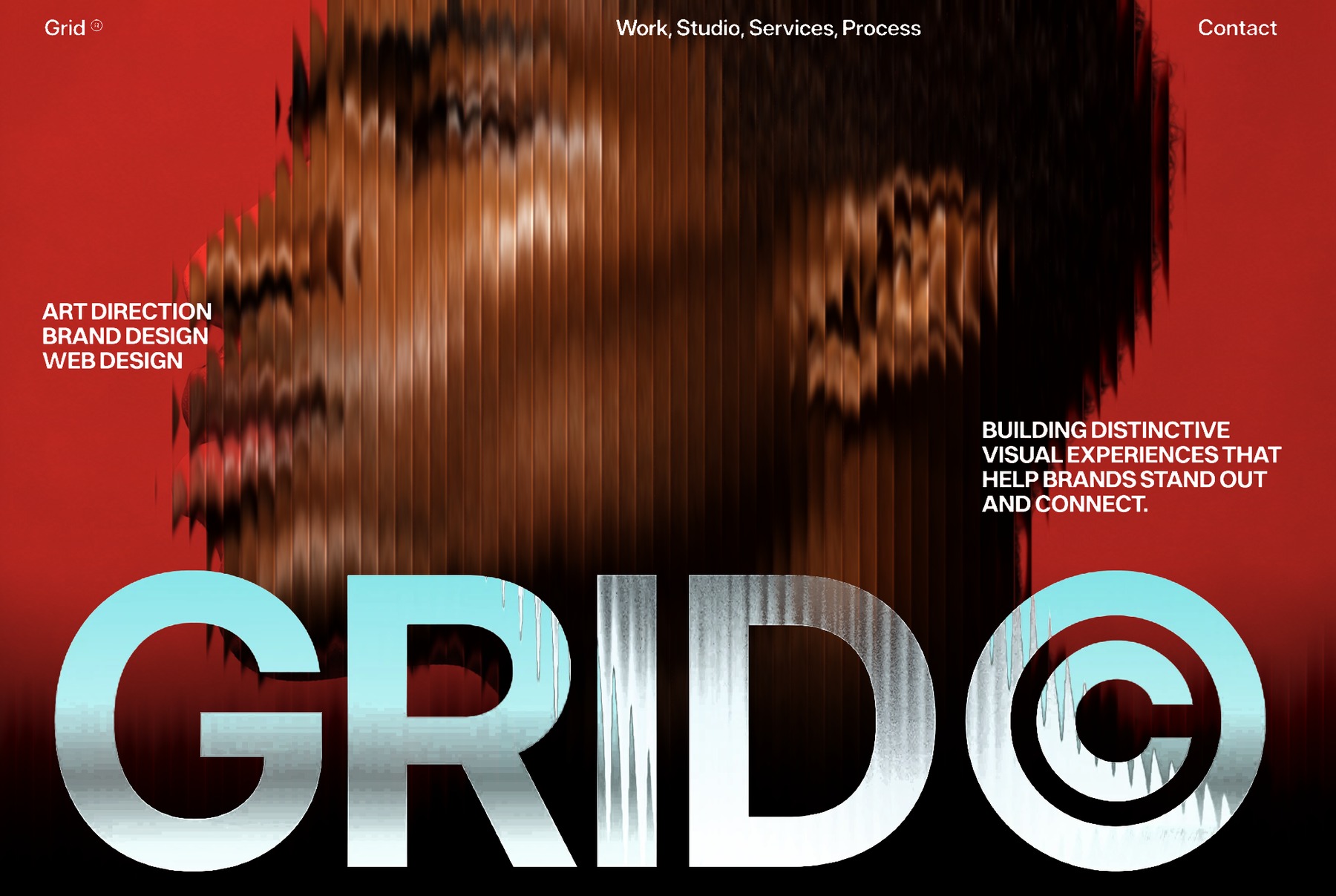
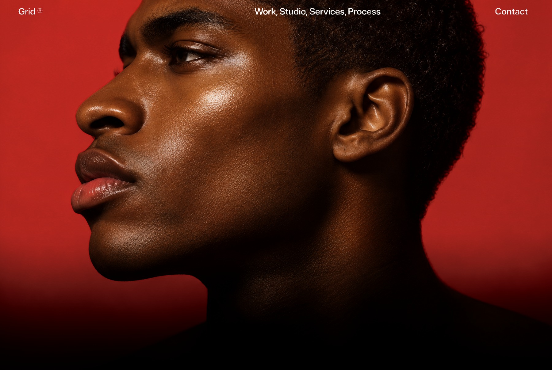
“Red background, add photo, looks fine. But add a glass effect and drop large text, now it’s a brand.”
Why it works
The red field and tight crop already have energy. The glass adds a recognizable texture, while the large, pale wordmark gives the eye a stable shape to land on. The cool accent separates the lettering from the warm photograph.
Notice the division of roles: the portrait carries emotion, the wordmark carries recognition, and the small navigation stays functional. The effect becomes a brand direction when its color, texture, and typography appear together across other touchpoints.
Build it in four moves
- Set one strong field. Start with deep red, then darken the lower edge to support the pale lettering. Keep the palette to red, dark neutrals, and one light accent.
- Crop with intention. Enlarge the portrait until the expression reads immediately. Leave a deliberate zone for the wordmark and small supporting copy.
- Add fluted glass to the artwork. Use narrow vertical bands that refract or offset the portrait. In a design tool, a practical approximation is to slice a duplicate photo into equal vertical masks and shift their image crops slightly. Keep an untouched copy underneath and reduce the effect until the face still reads.
- Let the wordmark own the bottom. Start around 85–95% of the frame width and tighten the spacing carefully. Keep the actual word legible before adding any surface treatment to the letters.
Design a responsive hero for [brand] with a deep red background and my supplied portrait. Make a short, oversized wordmark the dominant graphic element. Apply a subtle vertical fluted-glass treatment to the portrait artwork only; keep the face recognizable and all interface text sharp. Use a restrained pale-cyan accent. Keep navigation, a one-sentence introduction, and one clear CTA readable. First show the composition without the glass, then add the treatment. Preserve real, accessible text and make a separate mobile composition.
Give a playful image
a bigger idea.
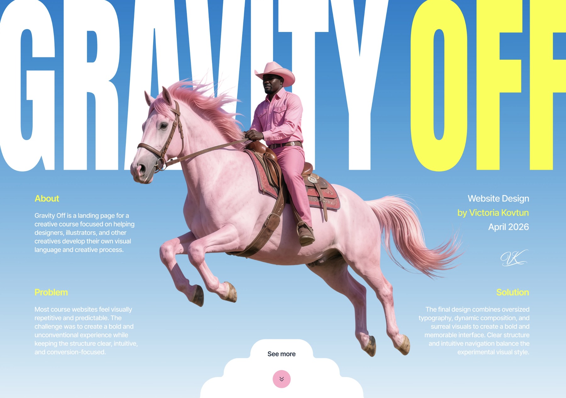
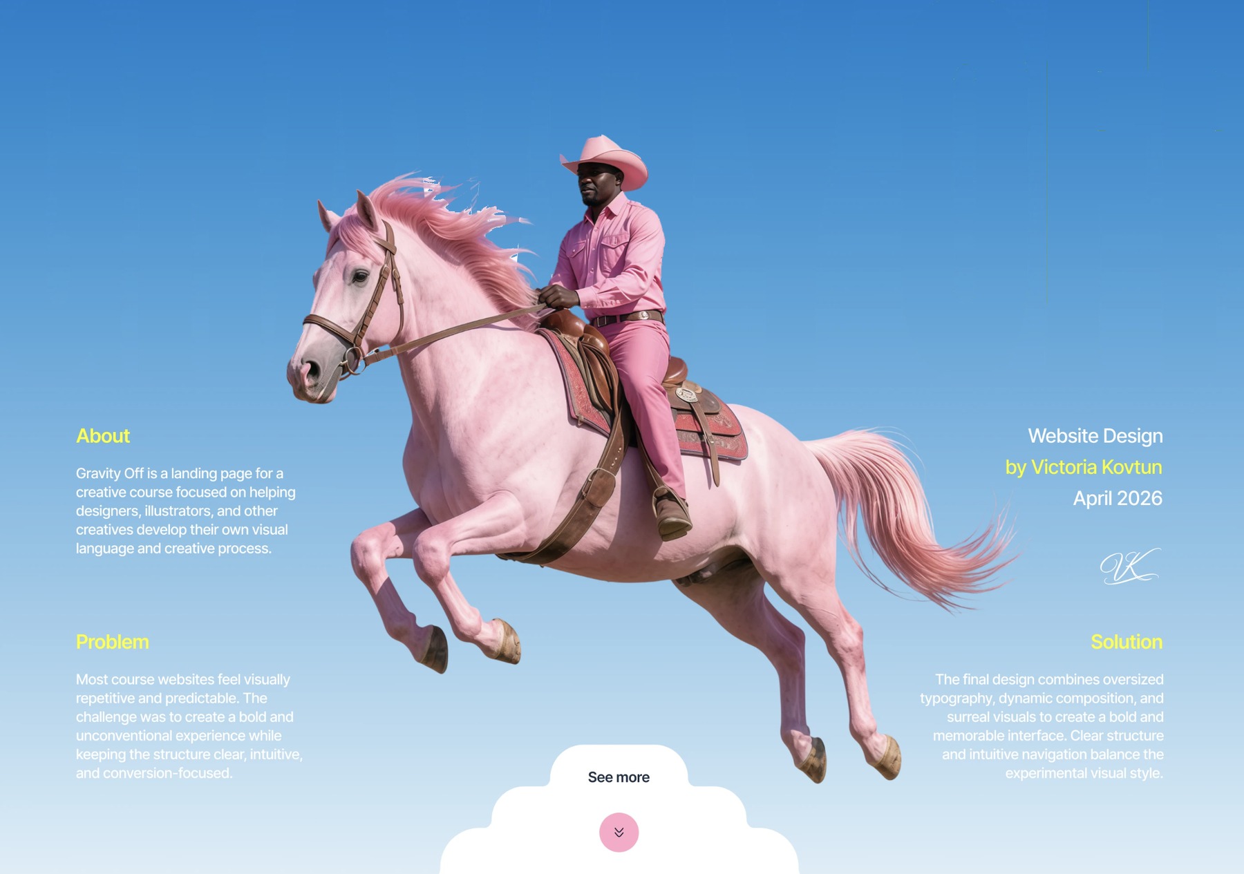
“Blue sky and pink horse looks cute. But add stretch text behind, now it’s a statement.”
Reference: Gravity Off by Victoria Kovtun ↗
Why it works
The tall letters change the proportions of the whole scene. They act like a backdrop, while the horse sits in front. That overlap tells us which layer is closer, so the headline and image feel like one composition.
The phrase “Gravity Off” also gives the floating horse a concept. The scale is expressive because the words, image, and feeling point in the same direction. Pink against blue creates the mood; the small yellow accent gives the composition another point of contrast.
Build it in four moves
- Choose a clean silhouette. Start with a subject you can separate from its background. Preserve details such as the mane, tail, and spaces between limbs in a transparent cutout.
- Fill the sky with a short phrase. Try a tall condensed display font first. Set the headline across most of the frame width, with a cap height around 40–60% of the hero as a starting point.
- Adjust proportions deliberately. Use a font’s width controls where available. If you stretch display lettering for an expressive result, keep it to this short graphic phrase. Body copy and buttons should retain normal proportions.
- Move the subject in front. Place the cutout above the type. Let it hide portions of a few letters, while preserving enough of the phrase to recognize it. Put supporting copy in the open areas around the silhouette.
Design a playful responsive hero for [brand] using a blue-sky background and my supplied transparent subject image. Place a very tall, condensed [headline] behind the subject. Let the subject overlap only part of the letters so the phrase remains recognizable. Use pink in the subject and one yellow accent. Keep body copy and controls at normal proportions. Show the layer order: sky, headline, cutout, interface. On mobile, reflow the composition and keep the CTA visible.
Make the type
part of the scene.
“Black base with a portrait looks creative. But add giant letters behind, suddenly you can’t look away.”
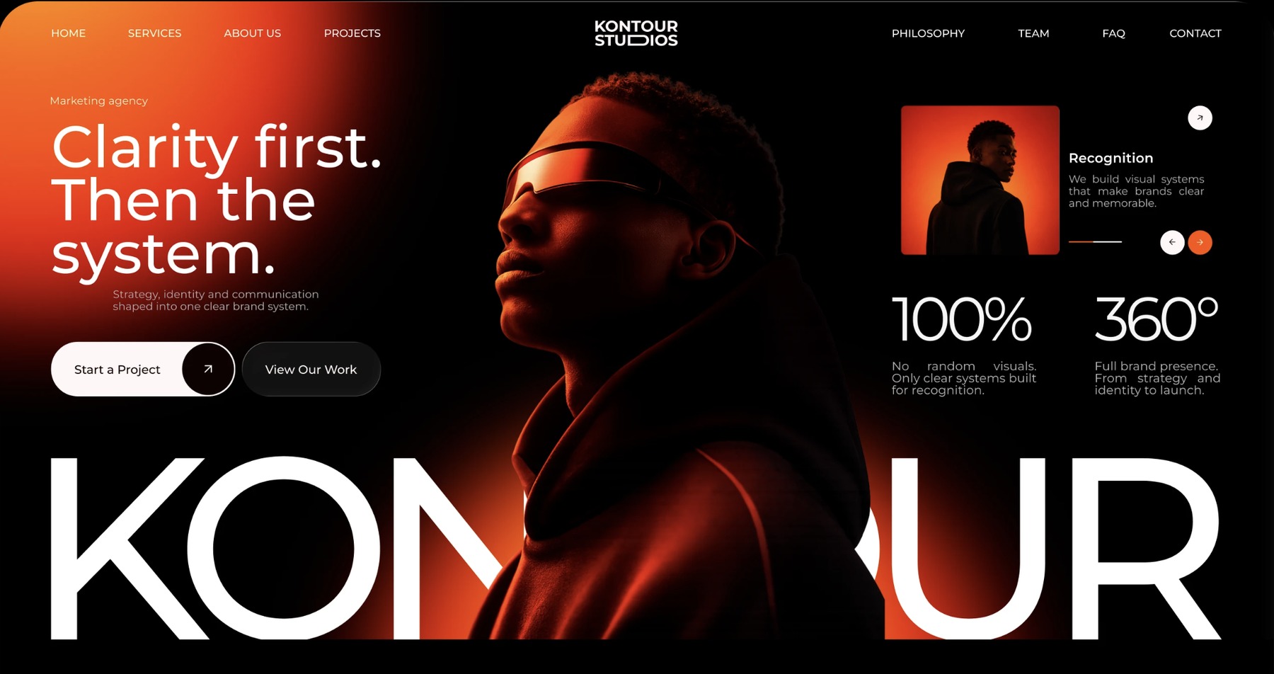
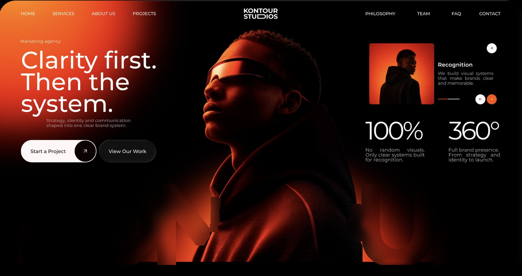
Reference: KONTOUR STUDIOS project by Pavel Lozovyi ↗
Why it works
The white letters create a strong light-dark contrast. The portrait interrupts them, making the person feel closer to us. Warm edge lighting separates the dark jacket and face from the background without lighting up every part of the frame.
The oversized wordmark and portrait function as one visual unit. Smaller copy can then explain the offer without competing at the same scale. The empty black areas are doing useful work: they separate the elements and help the silhouette read.
Build it in four moves
- Begin near black. Add a restrained warm glow where it supports the subject. Leave other areas quiet enough for readable copy.
- Prepare the portrait cutout. Choose a photo with a distinct outline and directional light. Refine the hair and shoulders so the overlap with the letters looks intentional.
- Set a nearly full-width wordmark. Place it above the background but below the portrait. Align it to a deliberate horizontal band, then move the person until the remaining letter shapes still suggest the name.
- Protect the reading path. Place the short introduction and CTA in open space. If the large wordmark is decorative or partly obscured, repeat the brand name clearly in the header and accessible page text.
Design a cinematic responsive hero for [brand] on a near-black background. Use my supplied portrait cutout with a warm rim light. Place an oversized white [wordmark] behind the portrait, spanning most of the hero width, with enough visible letter shapes to recognize the name. Keep the introduction, navigation, and CTA in quiet, readable areas. Repeat the brand name in accessible text if the decorative wordmark is partly hidden. Check the silhouette, contrast, and mobile layout before adding any motion.
Same layout.
Different first impression.
Move the slider. Notice how changing just one element changes what you see first.
The navigation and button stay the same size. That difference is what makes the headline feel big.
Big idea.
Small checklist.
The size ranges above are starting points for your own experiments, not measurements from the original project files.
Save the checklist + prompts- Squint at the page. Is there one obvious focal composition? If everything shouts, make the supporting elements quieter.
- Read the actual message. Can someone understand what the site offers and spot the next action, even with the visual treatment removed?
- Test a narrow screen. At around 390px wide, reflow the headline, reposition the subject, and keep controls clear. Don’t just shrink the desktop screenshot.
- Keep real text readable. Use live text for useful content. Decorative image text needs an accessible equivalent. Aim for at least 4.5:1 contrast for normal text and 3:1 for large text, as defined by WCAG’s contrast guidance.
- Stop at the strongest move. If the giant type and overlap already carry the idea, another glow, animation, or effect may not help.
Learn from the composition.
Make the outcome yours.
These are toolandtea’s design breakdowns of the three references in the “BIG” reel. The stage images are the reel’s illustrative breakdowns, not original layered project files. The explanations and suggested settings are our analysis; they do not claim to document the creators’ exact process.
- GRID: reference supplied for the reel; original creator not verified.
- Gravity Off: Victoria Kovtun’s creative course landing page.
- KONTOUR STUDIOS: Pavel Lozovyi’s website and brand identity project.
- Implementation references: MDN backdrop-filter, MDN stacking contexts, and W3C text contrast.
Use your own photographs, words, and brand assets when applying these principles. Choose one thing to exaggerate, then give it the space to work.